
Context is what lets our brains make sense of the world. Without it, life is a parade of meaningless noise.
For artists, galleries, and museums, context about their pieces and objects comes in many forms: a conversation, tours, social media posts, etc. But most often, context is presented in small pieces of paper that people glance at for a moment: exhibit labels.
In this article, we’ll start by explaining what exhibit labels do: for you and for the person reading them. Then we show you what to include in an artwork label, and how museum labels differ.
You’ll see examples of labels for many situations. Next, we dive into design, touching everything from fonts and colors to spacing and accessibility. We even explain how to position labels near the thing you’re labeling.
Last, we’ll provide a step-by-step tutorial on printing and mounting exhibit labels.
What are artwork labels and exhibit labels?
Exhibit labels for artwork or museum objects provide answers to essential questions: what, who, when—and increasingly—the where and why. They explain what this thing we’re looking at it is. Labels tell us who created this thing or where it originates, and explain when it was made. They tell us what materials it is made from, and what it’s used for, if it’s an object in a museum.
Exhibit labels provide context about an artist’s techniques, life experiences, or even the social context of a specific time and place. This practice invites visitors to connect with the art by connecting with the artist. In 2023, a University of Pennsylvania study found that people enjoyed paintings more after reading about the artist and their techniques. Another study in 2017 found that people “spend most of their time with the label”, not the work itself.
What are the different types of exhibit labels?
Exhibit labels come in three types: introduction labels, section labels, and object labels.
Introduction labels are the first label that someone sees when they enter an exhibit. They use large font sizes with generous line spacing that can be read from several feet away. Introduction labels guide visitors into the themes of the art or objects they’ll see throughout the rest of the space.
Section labels introduce visitors to a topic, theme, or area of the exhibit focused on something specific. Like introduction labels, they use large font sizes, and clear, concise descriptions.
Object labels identify and describe one object or one work of art. They are short and to-the-point. The rest of this article focuses on object labels. Let’s first look at what things you should include.
What to include in artwork labels
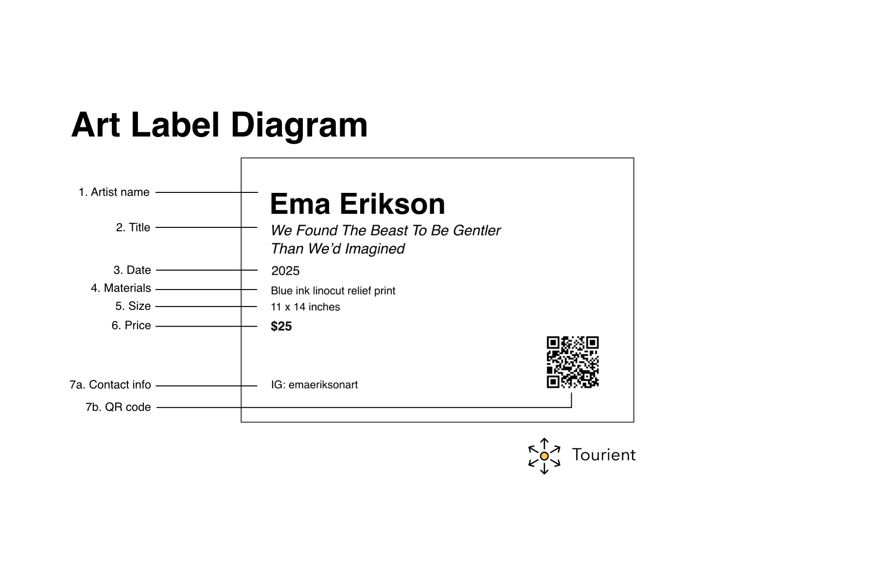
The artist’s name
The name is followed by birth and death dates.If an artist is alive, you’d see their year of birth: Ema Erikson (b. 1995)
If an artist is dead, you’d see their year of birth and year of death: Clyfford Still (1904—1904)
Galleries may include the nationality of the artist followed by their birth year on a separate line.
The title of the object
Titles are italicized to set them apart from the rest of the label's content. Sometimes the title is provided by the artist. Sometimes the gallery or museum titles the work. As Jill Sterrett writes in Object Labels 101, a title that includes a colon “hints that the name of the artwork has changed somewhere along the way”.The date or year the object was made
Sometimes the year follows the title (A Long Overdue Personal Decision, 2021) and sometimes it’s on a separate line.If a piece was created over a range of years, use an em-dash to separate them (2019 — 2024).
If it was created in two years, separate them with slash (1963 / 1993).
If the date of the work is unknown, include 'circa' before the date. Circa is often abbreviated as c. 1900 or ca. 1964.
The medium or materials used in the work
If made of more than one thing, do not just write ‘mixed media’ and call it a day. The more context, the better. Some artists list out every item in their pieces. Others list the major ‘ingredients’, and leave out the minor ones. How detailed you get is up to you. Some examples:
690 pastel pom-poms, small blue bear figurine, epoxy resin, gesso, canvas
159 lbs of glitterati candy
Acrylic on canvas
Video
Interactive SVG animation
The size of the work
It is standard practice to list the height, then width, then depth (if applicable) of the paper, canvas, or other material that serves as the base. For instance, 59 x 59 x 3 inches.Work that lacks physical dimensions like video or audio can instead be described by their duration in hours, minutes, and seconds.
You can list this as 2 hours, 34 minutes, 6 seconds or 02:34:06
If there are no specific dimensions, you can indicate this with: Dimensions vary or Dimensions variable.If a work is for sale: the price
How much does the work cost? Be realistic, but don’t undersell yourself.Contact information
The contact information you choose to include is up to you. Some artists embed a QR code that links to their website. Some list the URL directly. Some may add a contact email address or phone number, while others just add their social media handles.Description of the piece
If you’re selling your art directly or via a gallery, including a story or anecdote from creating the piece, or what was going on in your life at the time, is key to building an emotional connection with whomever may purchase your work.
In What Makes a Great Museum Label, Anna Faherty writes “people value the story behind an item, and the ability to share that story, more than the item itself.” The story is what sells your art.
Additional things to include in museum labels for objects
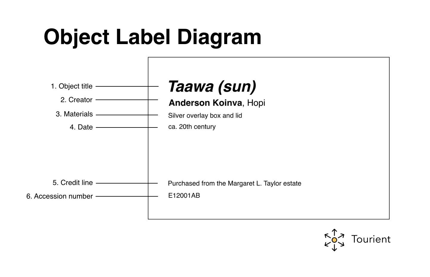
Credit line
The credit line indicates where an object or work of art is from. They are a public acknowledgement of a donor providing a work to an organization. Credit lines are used in museums and some galleries.
The language of a credit line describes a transaction of some kind, with terms like purchase, loan, courtesy of, donated by, promised, bequest, gift of, etc.Accession or acquisition number
This is a unique identifier that indicates when an object was added to a museum collection. It is usually the last item on a label. Some organizations call this an object number. The structure of this number is unique to each organization, and can sometimes be difficult to decipher without inside knowledge.Description of the work
Museum labels often include a description of the object or artwork. This description can be factual, or it can tell a story.QR Code link to audio guide
Museum labels may also include a QR code that links to an audio guide. This guide may include in-depth information, additional photos, videos, or an artist biography.
Exhibition Label Examples
Art for Sale
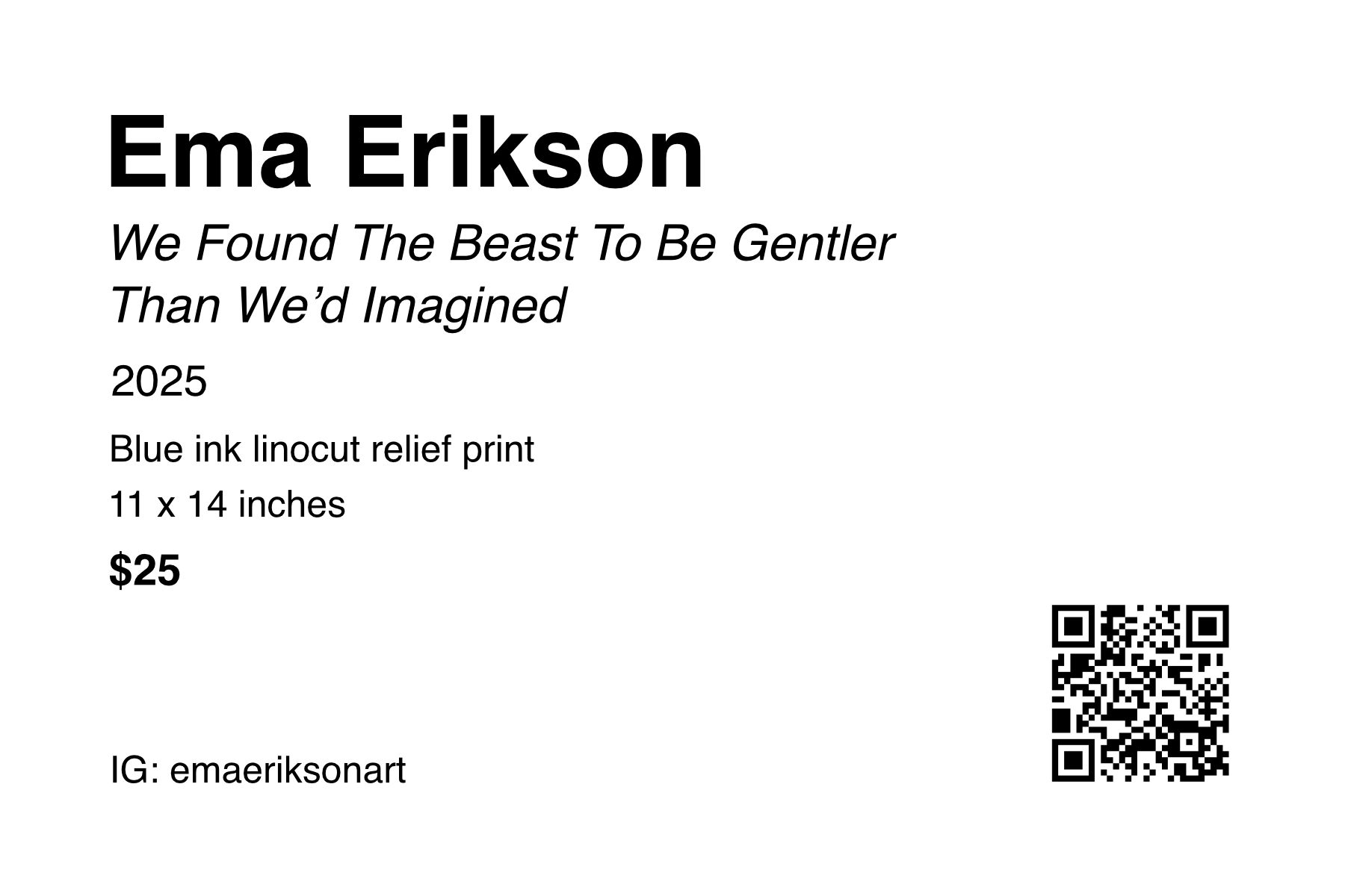
This label example is for Ema Erikson’s linocut print, We Found the Beast to be Gentler than We’d Imagined. Ema Erikson is an artist, printmaker, and illustrator based in Portland, Oregon.
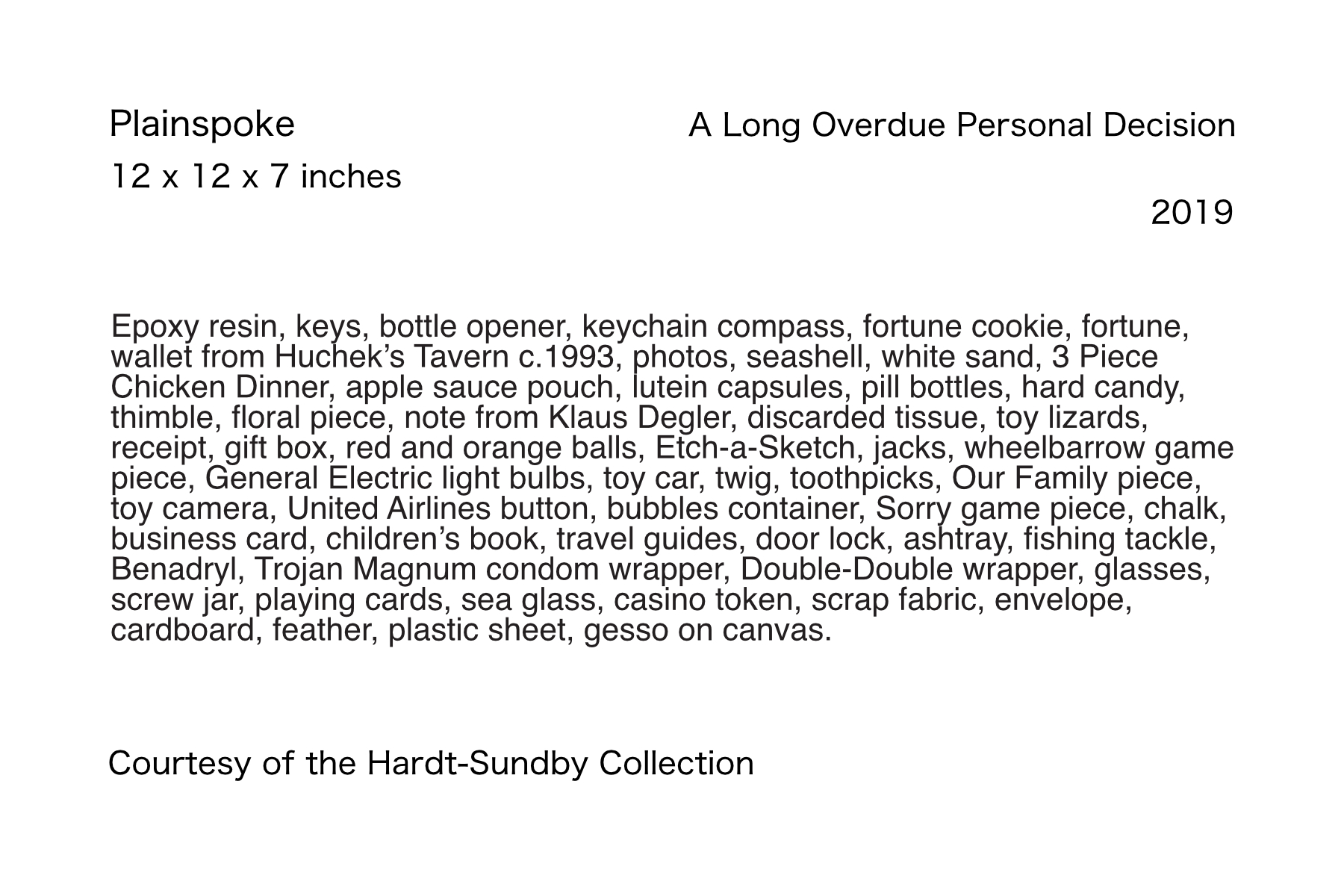
Loaned art
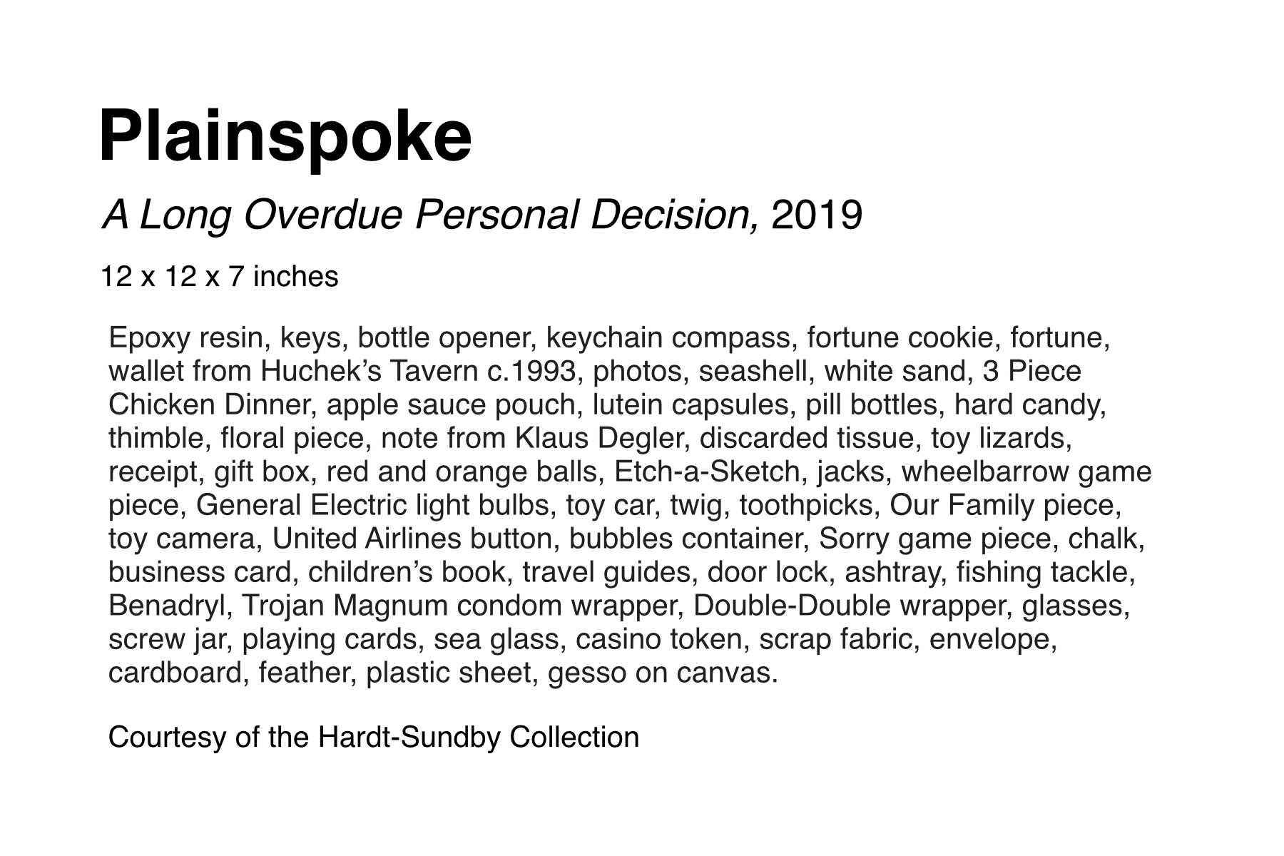
In this example, we have A Long Overdue Personal Decision, an assemblage piece by the artist Plainspoke, on loan from a private collection. The piece contains toys, bits of trash, food, flowers, and many other items. Its materials description is so long that font sizes and label structure have been modified to make room.
Durational art
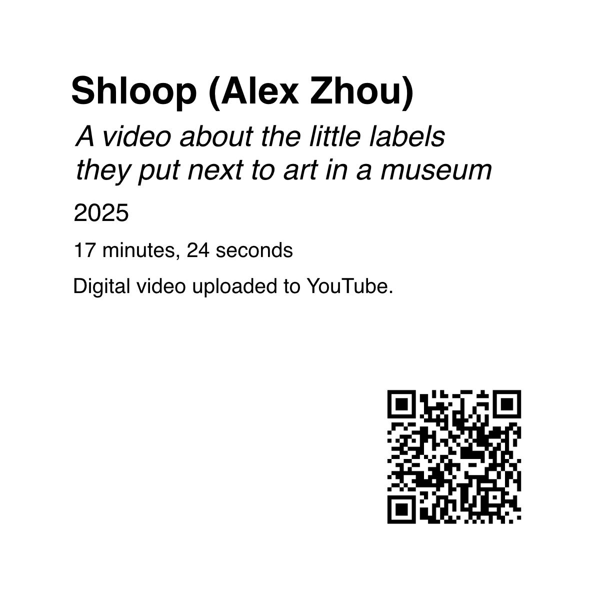
This square label is paired with a video about museum labels. You can scan the QR code to watch the video if you’d like. Rather than physical dimensions, the duration of the video is listed.
Interactive art
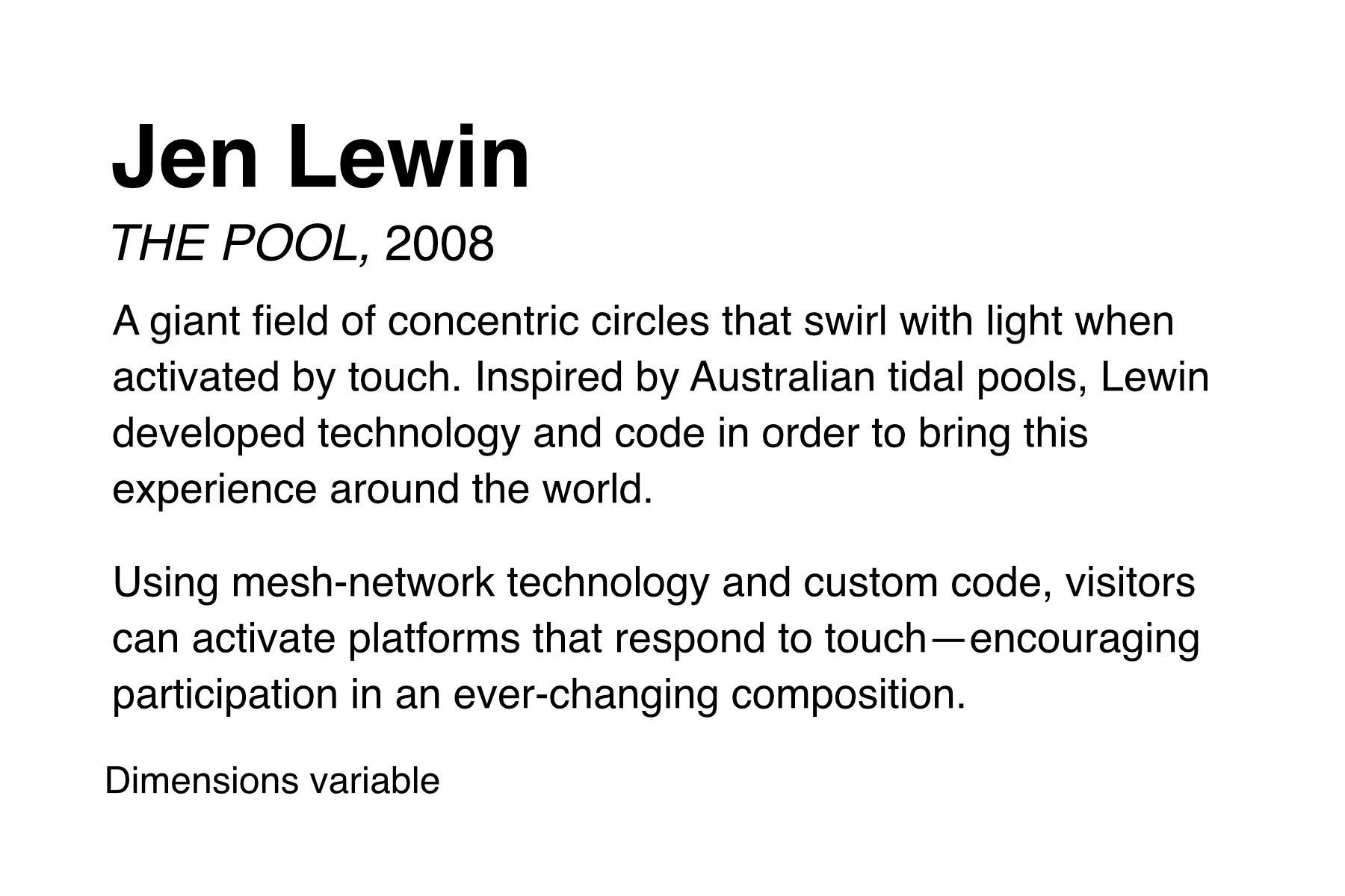
This label is for an interactive art installation by Jen Lewin, titled THE POOL. It lists the dimensions as variable, and includes a description of the art piece from the artist’s website.
Centralized Gallery Map
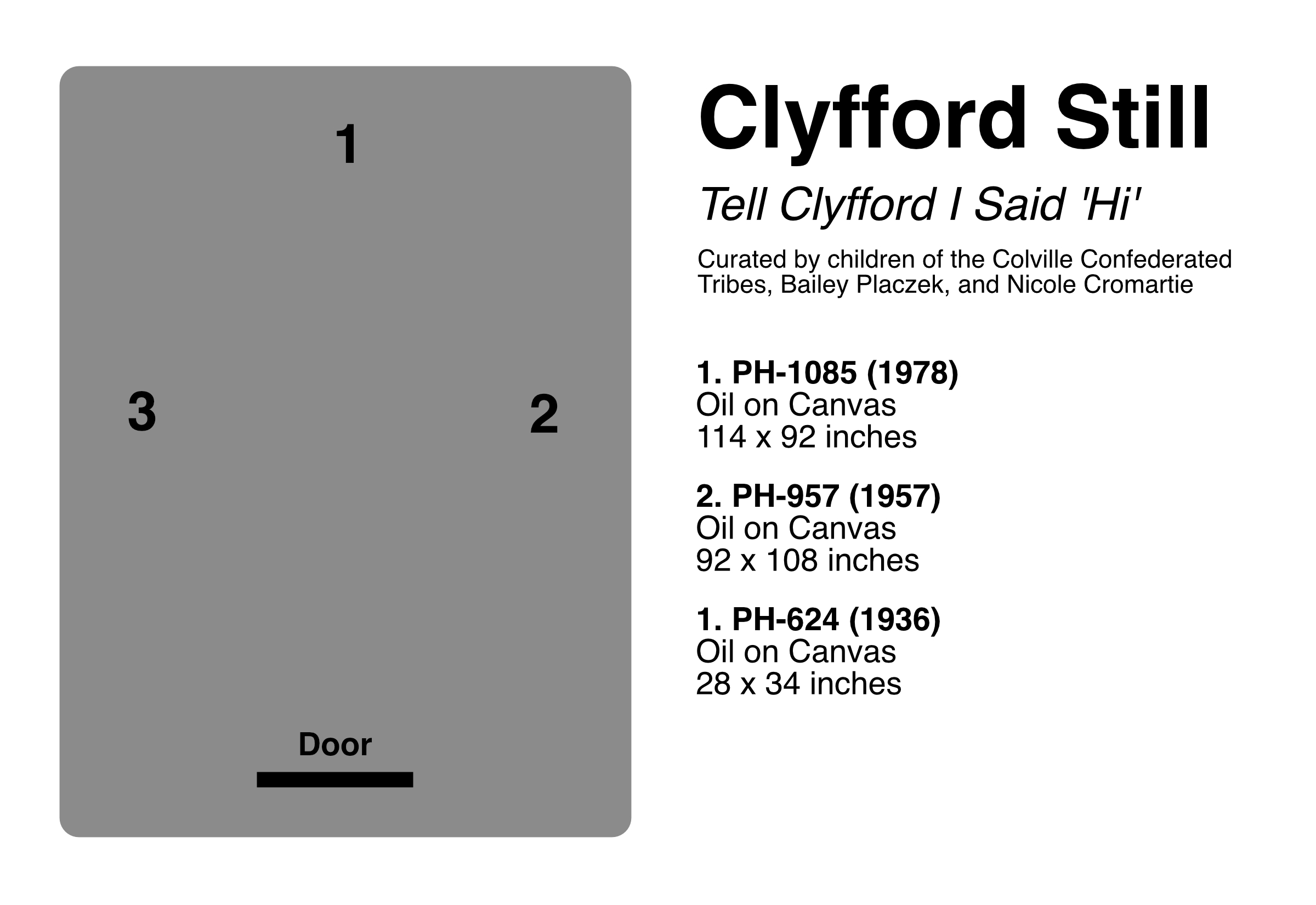
Galleries and museums with large objects can opt for a centralized label that is sometimes called a gallery map. The example shown above has a list of artwork or objects paired with numbers. And there's an illustrated map of the room with the locations of those numbered pieces.
We’d recommend also adding small labels near the pieces to reinforce what a visitor is seeing.
Museum wall label
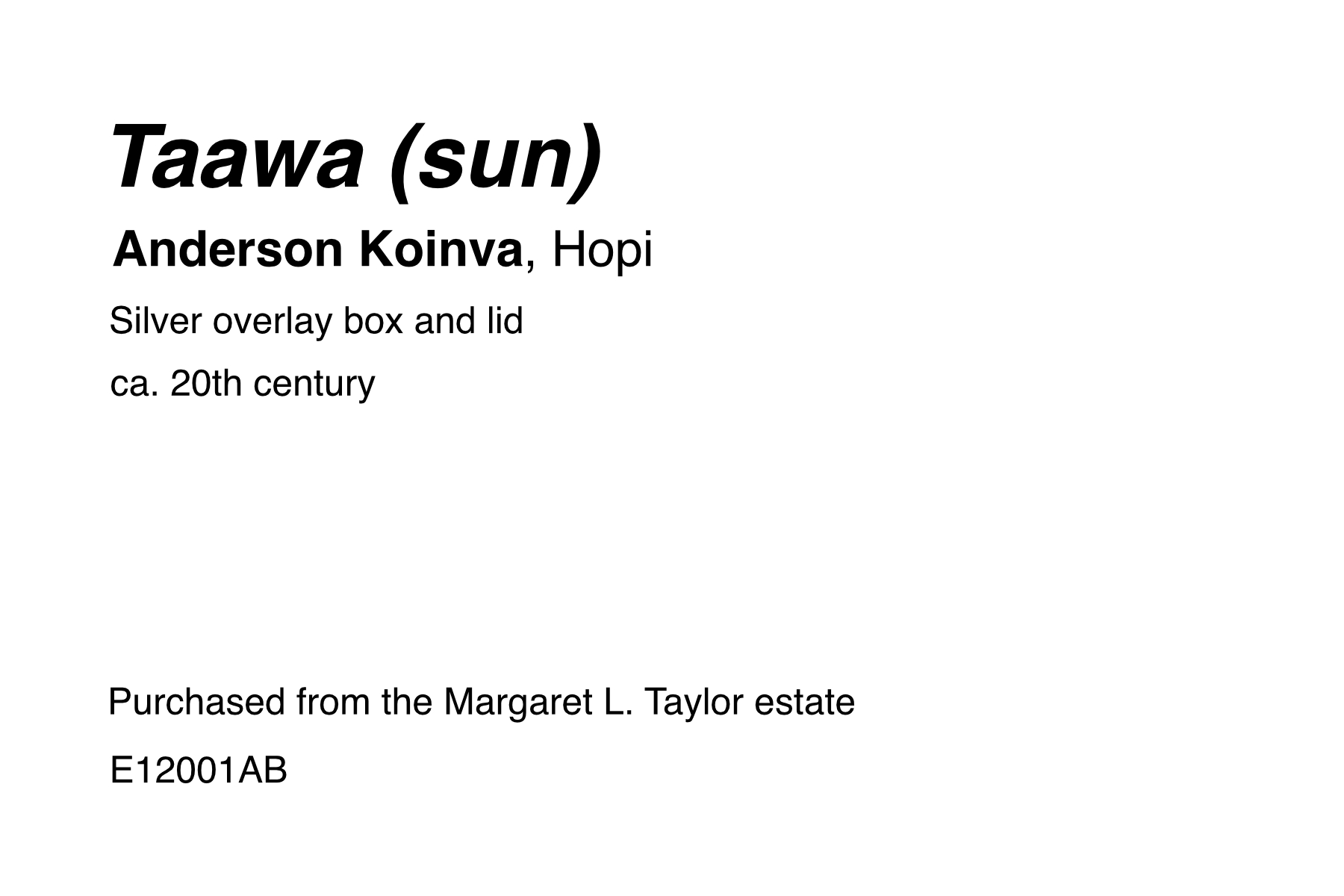
Here's an example from the Native Peoples of the Colorado Plateau exhibit at the Museum of Northern Arizona. It shows that not every label includes every piece of information. The label moves the object title to the uppermost position. And it includes the artist’s nationality (Hopi). The credit line states this work was purchased from an estate. And the accession number suggests it may have been acquired in 2001.
Audio tour label
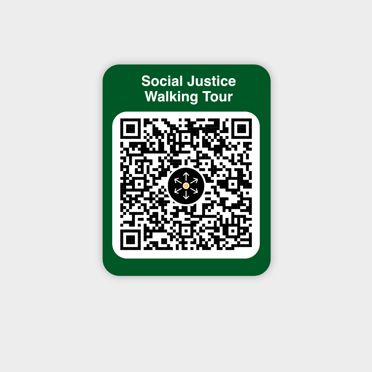
Labels for audio tours or mobile guides can look like anything. They can be a hybrid of artwork labels and museum labels. Or they’re just a QR code with an invitation to scan in a particular app, like this one for McLean County Museum of History’s Social Justice Walking Tour.
Best practices in designing exhibit labels
Remember that you are not designing the label for yourself. You are designing it for other humans to use. With that in mind, here are some best practices:
Sizing
There is no standard museum label size. It depends on space constraints, the types of information you need to convey, exhibit branding, and many other variables beyond the scope of this article. That said, a half-sheet of US letter paper (8.5” x 5.5”) [A5] is common.
Artwork labels, on the other hand, have standard sizes, including:
2” x 4” (5 cm x 10 cm)
3” x 5” (A7)
4” x 6” (A6)
8.5” x 5.5” (A5)
The artist name is usually the largest element. The work or object title is a little smaller than the artist name. The year is smaller than the title. And all other information is the same font size (though credit lines are sometimes even smaller).
Readability
Be concise. Use short sentences and simple language. Write paragraphs that are no longer than two to three sentences.
Avoid long paragraphs or “walls” of text. The more text you add, and the harder it is to read, the less likely someone is to read it. And don't forget to proofread.
The Smithsonian has a great guide on writing for exhibit labels: Interpretive Writing for Exhibitions.
How long should exhibit labels be?
Many labels are less than 30 words. If including anecdotes or a description, keep the total under 150 words.
Which fonts do exhibit labels use?
There are two main types of fonts: serif and sans-serif. Serif fonts have small decorative strokes at the edges of the letters. Sans-serif fonts lack these, yielding a cleaner and more modern appearance.
Common serif font options for exhibit labels include Times, Garamond, Optima, and DM Serif Display. Sans-serif font choices include Helvetica, Arial, Open Sans, and Sarabun.
Choose a font that’s easy to read up close and at a distance. Avoid decorative or exaggerated fonts.
What font sizes should I use for exhibit labels?
Font sizes are measured in points, abbreviated as ‘pt’. One point is equivalent to 1/6 of an inch, or 4 mm.
The right size font depends on the physical size of the label and the distance at which someone is expected to read it. When labeling museum objects in a case, use larger label sizes (and font sizes) than you would for a wall label.
Avoid using font sizes smaller than 12 pts. For our 4” x 6” example label above, we used Helvetica in various sizes and weights:
Artist Name: 32pt Bold
Title of Work: 16pt Italic
Year: 14pt Regular
Price: 14pt Bold
Everything else: 12pt Regular
Structure and Spacing
Once you have a label that is readable for your audience, let’s structure it to be accessible and useful. Look at the following two examples. Which one is easier to quickly glance at and digest?
The one on the left has adequate space to visually distinguish the elements. Appropriate spacing makes it easier to digest the label content. Spacing allows breathing room around text, and reduces visual clutter. Align text to the left for better readability, and use generous line spacing between text.
At a glance, the label on the right is impossible to read quickly. Our eyes can’t tell which parts of are important and which can be ignored, as all of the text is the same font size. The text aligned to both the left and right sides and lack of spacing between lines makes it feel cluttered.
Colors
We recommend black text on white paper. Or you can use black text on off-white paper to maximize contrast and minimize glare.
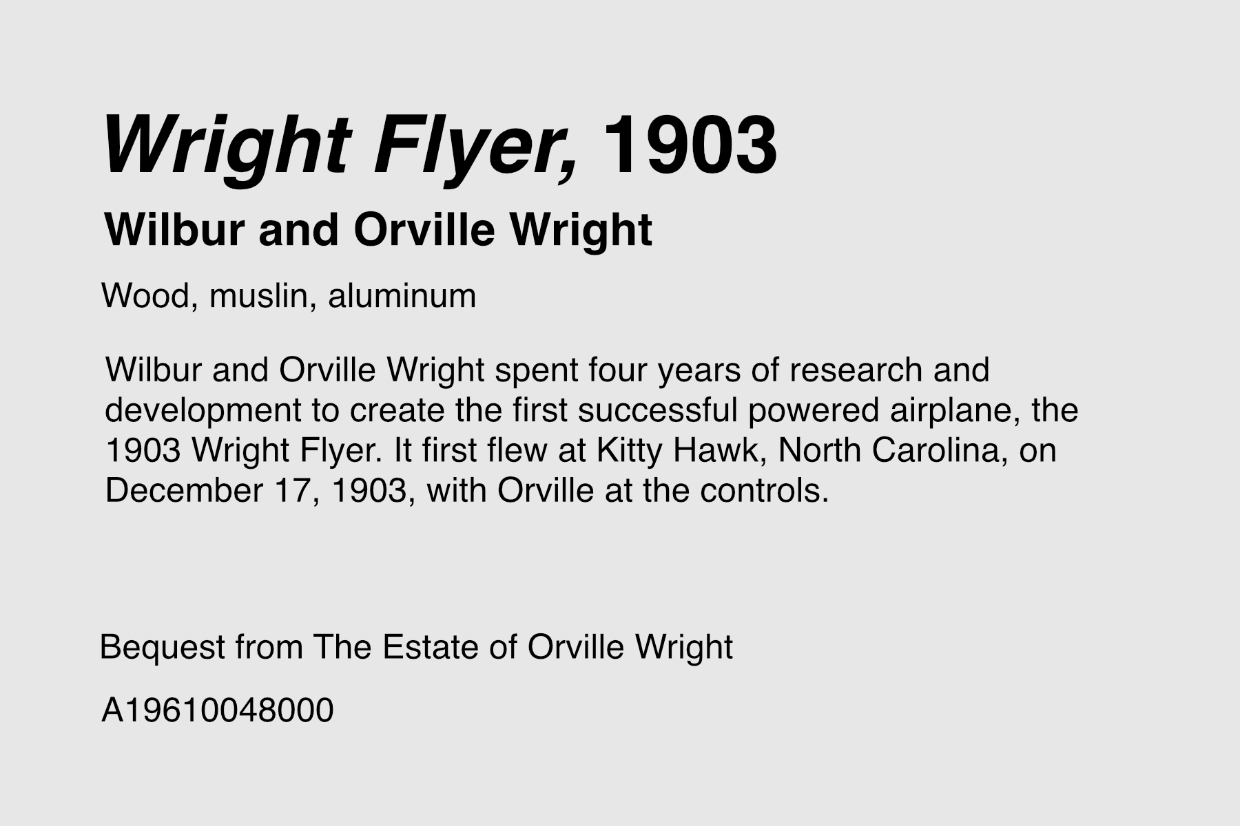
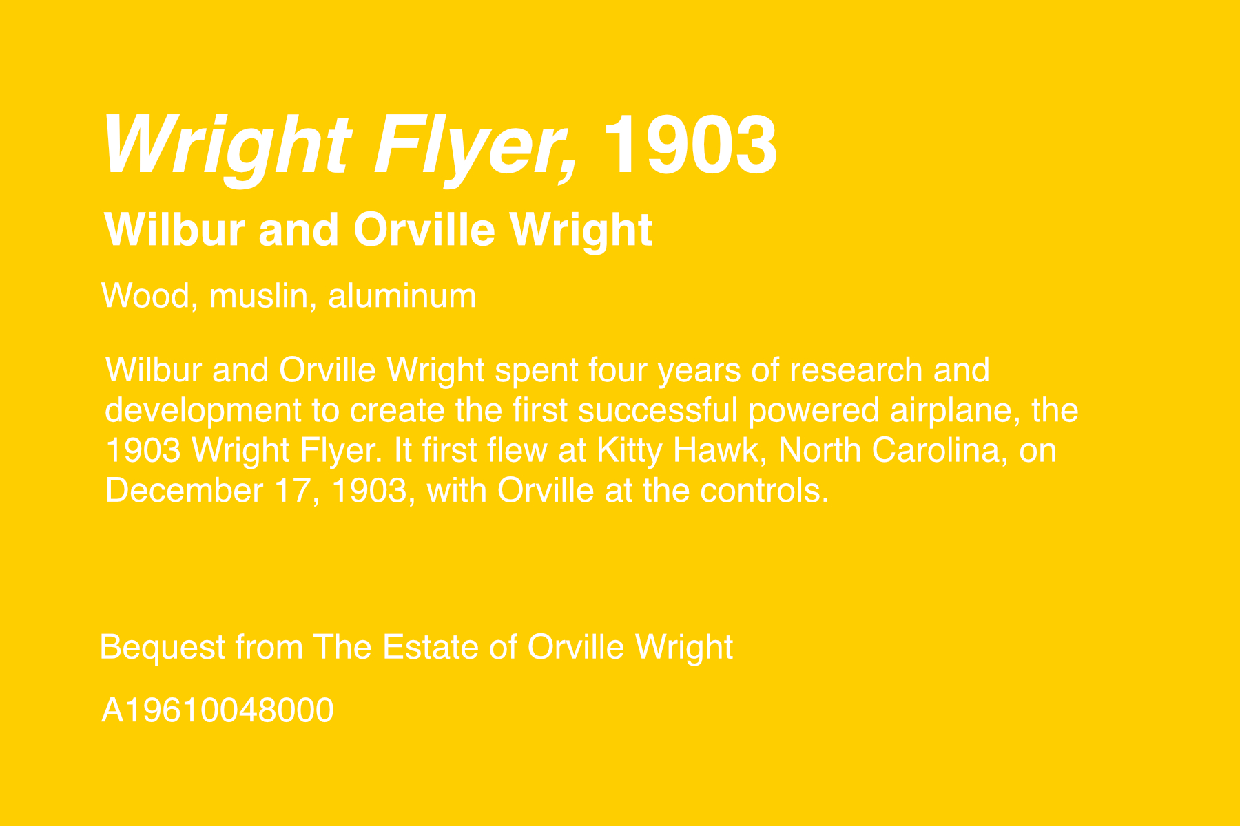
This label, for the 1903 Wright Flyer, is shown above on both off-white and white backgrounds in black text. The US National Park Service uses black text on an off-white background to reduce glare.
When including colors, make sure they’re easily readable by people with color blindness, low vision, or impaired vision. To do this, use a contrast checker tool to compare background and foreground colors.
Here’s an example of low contrast color choices on a label. It uses white text on a yellow background and is difficult to read.
Consistency
Every label in an exhibit should use consistent structure, spacing, font sizes, and colors. This practice improves readability, accessibility, and perceived professionalism.
And proofread your labels. Museums and galleries spend hundreds of thousands to millions of dollars on exhibits, yet can be careless when it comes to checking spelling. Don't make their mistake.
Incorporate feedback
Designing high-quality exhibit labels is not work done in a silo. Incorporating staff and visitor feedback is essential to creating practical, accessible, and useful labels.
If visitors complain that your labels are mounted too low to read, move them. If they can’t read the font size, make it bigger. Labels are meant to invite curiosity, not prevent it.
Over time, your labels will become outdated. Regularly audit your label text and update it to align with changing cultural expectations, trends, and new discoveries.
Where should exhibit labels be placed?
Place exhibit labels near the piece of art or object they describe. The label should be easy to see without blocking the object or artwork, and placed at a natural height for reading.
General guidelines for positioning
Place labels near the object. Avoid centralized labels if possible (see an example above), as it can be difficult for visitors to tell which object a particular label is for.
Labels placed on a wall should be no lower than 40 to 50 inches (1 to 1.3 meters).
Avoid placing labels on the ground or at ankle height. Anyone who wants to read them would need to bend over or sit on the floor. This makes them inaccessible to people with mobility issues.
Use a ruler and pencil to mark label positions, and a level to get your angles straight.
If you’re selling your art, avoid attaching the label to the art itself.
Positioning labels near museum objects in a case
Place labels inside the case near the object they are labeling.
Place labels that are below eye level on a tent card or angle (30 to 35º) so they can be read comfortably. Do not put them vertical or horizontal.
How to Print and Mount Exhibition Labels
Once you’ve designed your labels, it’s time to print and mount them. Artwork and exhibit labels can be made of many materials, ranging from printer paper and poster-board to professionally-printed plastic placards. In this article, we’re focused on do-it-yourself methods, but we do touch on professional printing options below.
1. Prepare design for printing.
Prepare the labels by adding a border or outline to follow when cutting. Then flatten the layers in export, and set text as outlines (or text as curves in Affinity Designer). Also set your colors to CMYK to prevent issues when printing.
2. Select paper and mounting board.
Paper
For this tutorial, we’ll select acid-free card stock in white.
Mounting board
You’ll need a thicker material to mount the paper to. We like these pre-cut mat board sheets that come in a range of standard sizes. You can buy larger pieces of mat board and cut them down to the size you need. Foam-board tends to crumple at the edges when cutting, and poster-board is too flimsy for most uses.
3. Print the labels.
Print the label design onto the labels using any ink jet or laser printer.
Professional printing: There are a myriad of professional printing options. You could print stickers. Manufacture plastic or metal placards. You could screen print onto fabric or glass. Or create Coroplast signs, dry-transfer labels, vinyl banners, and other large-format products.
4. Cut out the labels and mat board.
Choose a cutting tool. Options include:
Cut along the border until the label is free to roam. Repeat for other labels.
Then, cut out an identically-sized piece of mat board, or use pre-cut mat board.
5. Glue the label to the mat board.
With your label and mat board cut out, it’s time to choose a glue to adhere the label to the mat board. We recommend a spray glue for even coating and ease of application, like Super 77 Low VOC Spray Adhesive.
Spray your glue of choice onto the mat board, coating one entire side.
Align the edges of the label with the edges of the mat board. Press down firmly from one end to the other.
Continue pressing (perhaps with the weight of a book) for the bond time specified on the glue packaging. Super 77 can bond in just 15 to 30 seconds.
Repeat for remaining labels.
6. Attach label to wall or surface using a wall adhesive or mounting product.
Now that you have your label printed and adhered to mat board, it’s time to attach it to the wall.
Follow our positioning tips to mark the place and make sure it’s level, and then decide on a wall adhesive or mounting product that is appropriate for your surface and exhibit. There are temporary adhesives and permanent ones.
Temporary adhesives
Temporary adhesives usually won’t damage the wall or surface you’re mounting to, and are best for short-term exhibitions and gallery shows.
Glue Dots: These sticky dots are an inexpensive mounting option (under $7). They're easily applied and repositioned, sturdy for lightweight labels, and leave no residue when removed.
Hot Glue: Many museum professionals use a glue gun to place small dollops of hot glue on the back of their mounting board, then quickly press that against the wall or surface. Once dried, it can be removed and leaves behind no residue.
Command Picture Hanging Strips: Picture hanging strips are removable and provide a floating look similar to the foam tape above. The caveat is they don’t adhere to all surfaces.
3M Double-sided foam tape sits somewhere between double-stick scotch tape and command strips. Foam tape is a pressure-sensitive adhesive, meaning that it activates the bonding as you apply pressure.
Velcro Tape: Another option is a roll of velcro tape. Cut the strips to size, and attach the adhesive sides to the wall and the mounted label. The adhesive takes 24 hours to reach its full strength
Permanent adhesives
Permanent adhesives will damage the surface you’re mounting to when trying to remove them.
Super 77 spray adhesive If you’ve used this to adhere your paper to your mat board, you could also use it to adhere the mat board to the wall. Note that it is permanent. When removing, it will likely take pieces of the drywall with the label.
3M structural tape is used in construction of high-rise buildings, airplanes, cars, and many other commercial applications. The longer it sits, the stronger it gets. Use structural tape for mounting heavy labels to concrete or metal surfaces.